Latest topics
InterContinental Hotel ware
3 posters
NEW ZEALAND POTTERY :: Crown Lynn :: Crown Lynn Tableware Patterns :: Crown Lynn Vitrified and Super Vitrified Ware
Page 1 of 1
 InterContinental Hotel ware
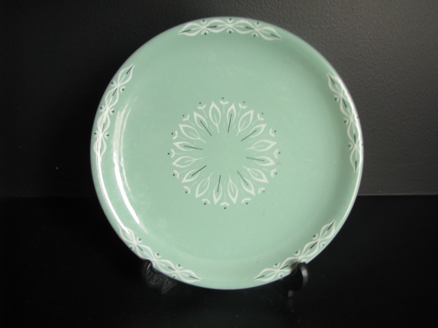
This pattern that was made by Crown Lynn was used exclusively by the InterContinental Hotel

 Re: InterContinental Hotel ware
Hi Ev
Thats a pretty pattern, I saw an oval plate on Trade Me with that pattern.
spacifica
Thats a pretty pattern, I saw an oval plate on Trade Me with that pattern.
spacifica
spacifica- Number of posts : 19
Registration date : 2010-08-12
 Re: InterContinental Hotel ware
Alan Topham was telling me that this patterned ware was made for the New Intercontinental Hotel in the 1970's.
Transfers had to be made of their insignia and were fired onto the bisque ware.
They were extremely pedantic about the colour, as it had to be the exact shade of blue that they wanted. Someone came out from England [?] to make sure that it was all done correctly.
Transfers had to be made of their insignia and were fired onto the bisque ware.
They were extremely pedantic about the colour, as it had to be the exact shade of blue that they wanted. Someone came out from England [?] to make sure that it was all done correctly.
 Re: InterContinental Hotel ware
In the 1968 NZ Ceramics magazine there is an article about the Intercontinental Hotel. The Captains Galley Restaurant was supplied with the pattern above that uses a compass motif. This was done by using a silkscreen transfer under the glaze.
The exclusive Top of the Town Restaurant had a pattern of it's own and thanks to that article I was ever so pleased to find a piece today. They didn't give the pattern a name, but I will use 'Intercontinental Top of the Town' for now.


The exclusive Top of the Town Restaurant had a pattern of it's own and thanks to that article I was ever so pleased to find a piece today. They didn't give the pattern a name, but I will use 'Intercontinental Top of the Town' for now.


 Re: InterContinental Hotel ware
Had the privilege of dining off that pattern in the late 60's in the Top of The Town with the great Nancy Harrie entertaining on the piano. Great that you have a piece of the service.
We used to be call it The Big Brick Hut on the Hill .
At the risk of being boring the A of course is for Auckland in Hong Kong it was a Chinese Symbol like two H's
We used to be call it The Big Brick Hut on the Hill .
At the risk of being boring the A of course is for Auckland in Hong Kong it was a Chinese Symbol like two H's

Jonno- Number of posts : 662
Location : Milford,Auckland
Registration date : 2011-05-13
 Re: InterContinental Hotel ware
Well thank you Jonno ! Some Intercontinental wares have just the A with the circle of writing and I wondered what it stood for.
The big brick hut on the hill does not sound very posh.....
The big brick hut on the hill does not sound very posh.....
 Re: InterContinental Hotel ware
Oh yes when it first opened it was very posh by NZ Hotel standards of those days.
The Red Brick Hut was really a bit of Kiwi inverted slang for such a large and well appointed hotel.
The Red Brick Hut was really a bit of Kiwi inverted slang for such a large and well appointed hotel.

Jonno- Number of posts : 662
Location : Milford,Auckland
Registration date : 2011-05-13
 Re: InterContinental Hotel ware
Always find something when I'm looking in the records for a certain pattern ...
There appear to be three different patterns used for the Intercontinental -
990 Banquet Hall
991 "Coffee Shop"
975 Silkscreen
I would hazard a guess that the 975 Silkscreen is the Teal with the compass motif ...
Any further suggestions?
There appear to be three different patterns used for the Intercontinental -
990 Banquet Hall
991 "Coffee Shop"
975 Silkscreen
I would hazard a guess that the 975 Silkscreen is the Teal with the compass motif ...
Any further suggestions?
 Re: InterContinental Hotel ware
Long time ago but I am fairly certain that the first design on this thread with the A symbol was the pattern used in the dining room on the top floor which I seem to recall was called 'Top of the Town'
The Coffee Shop was on the ground floor and was the breakfast dining room, also on the ground floor was the events room which I guess is what is described as the Banquet Hall. I remember it being used for various functions and events. Can't be sure but I suspect the Blue compass rose design was used in the Coffee Shop . In Singapore and Hong Kong the Coffee Shops were open 24/7 but not sure if that was so in Auckland.
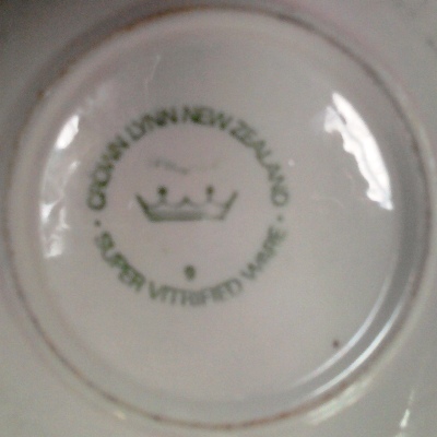
Finally I note that the backstamp has a 9 which indicates that that particular plate was made in 1969 and is Super Vitrified Ware.

Jonno- Number of posts : 662
Location : Milford,Auckland
Registration date : 2011-05-13
NEW ZEALAND POTTERY :: Crown Lynn :: Crown Lynn Tableware Patterns :: Crown Lynn Vitrified and Super Vitrified Ware
Page 1 of 1
Permissions in this forum:
You cannot reply to topics in this forum
» Steenstra Vase with decals
» Steenstra Brick Clay Vase being used for the first time!
» Kermiko Vase in pastel green
» Temuka hand painted fun bowl.
» Carrick Oliver coffee pot
» Is this a Dorothy Thorpe cream jug? No mark stamped
» Name this plate please. It's Riverside.
» Titian Studio Presley Ware V117 stunning lustre glaze